Make Accessibility a Priority for Your Publication
It’s important to set clear goals around accessibility so that you know what to strive for. There are guidelines that apply to all publications, but you should also consider your industry. There may be specific standards relevant to your target audience or medium.
If you’re starting a new publication from scratch, it will be relatively easy to set measurable objectives. After all, you can build inclusive practices into each step of your design workflow. But even if you are making changes to an established magazine, you can set goals that keep accessibility a priority. Start by auditing your current end product through the lens of inclusive best practices. What’s missing? What’s causing challenges? What can be improved?
Depending on the nature of your publication, your industry, and the changes you’re making, you may need outside help. There are automated tools that can help, especially for digital publications. Or, an accessibility expert can help you analyze your magazine and create an experience that is usable and enjoyable for everyone.
Testing is a critical step in the design process. Getting this feedback can help ensure that your publication meets or exceeds accessibility standards. If you’re able to put together a focus group of readers or users who need accessible options, you could learn a lot about how well you’re doing!
Tips for Accessible Design in Print Publications
- Choose fonts that are easy to read, especially for body copy. Avoid or limit decorative fonts that are hard to make out. You should aim to have any typographical treatments remain readable.
- Ensure high contrast between text and background colors to enhance readability. You can use a color contrast checker to verify that your selections are readable.
- Keep in mind that font size and spacing affects many readers, including those with low vision or dyslexia.
- Avoid relying only on color to convey information.
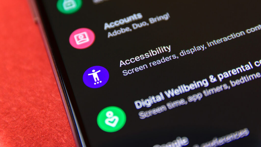
Tips for Accessible Design in Digital Publications
 Use clear navigation so that all users can access your publication, including those using assistive technology.
- Provide alternative text (alt text) for all images. Alt text should convey the essential information and context of the image to show its significance.
- Make sure you include captions or transcripts for videos to make the content accessible to deaf or hard-of-hearing users. You should also include audio descriptions for visual elements to assist blind or visually impaired users.

As your design partner, Bonotom Studio is committed to supporting your accessibility efforts. We are here to help you make your publications the best they can be, whether that’s from an artistic standpoint or an inclusive one. If you take proactive steps toward making your association magazine accessible, you’re rolling out the welcome mat for everyone!