This article was originally published in the May/June issue of Contingencies magazine as part of their 30th Anniversary celebration. The original article can be found at contingencies.org/30th-anniversary.
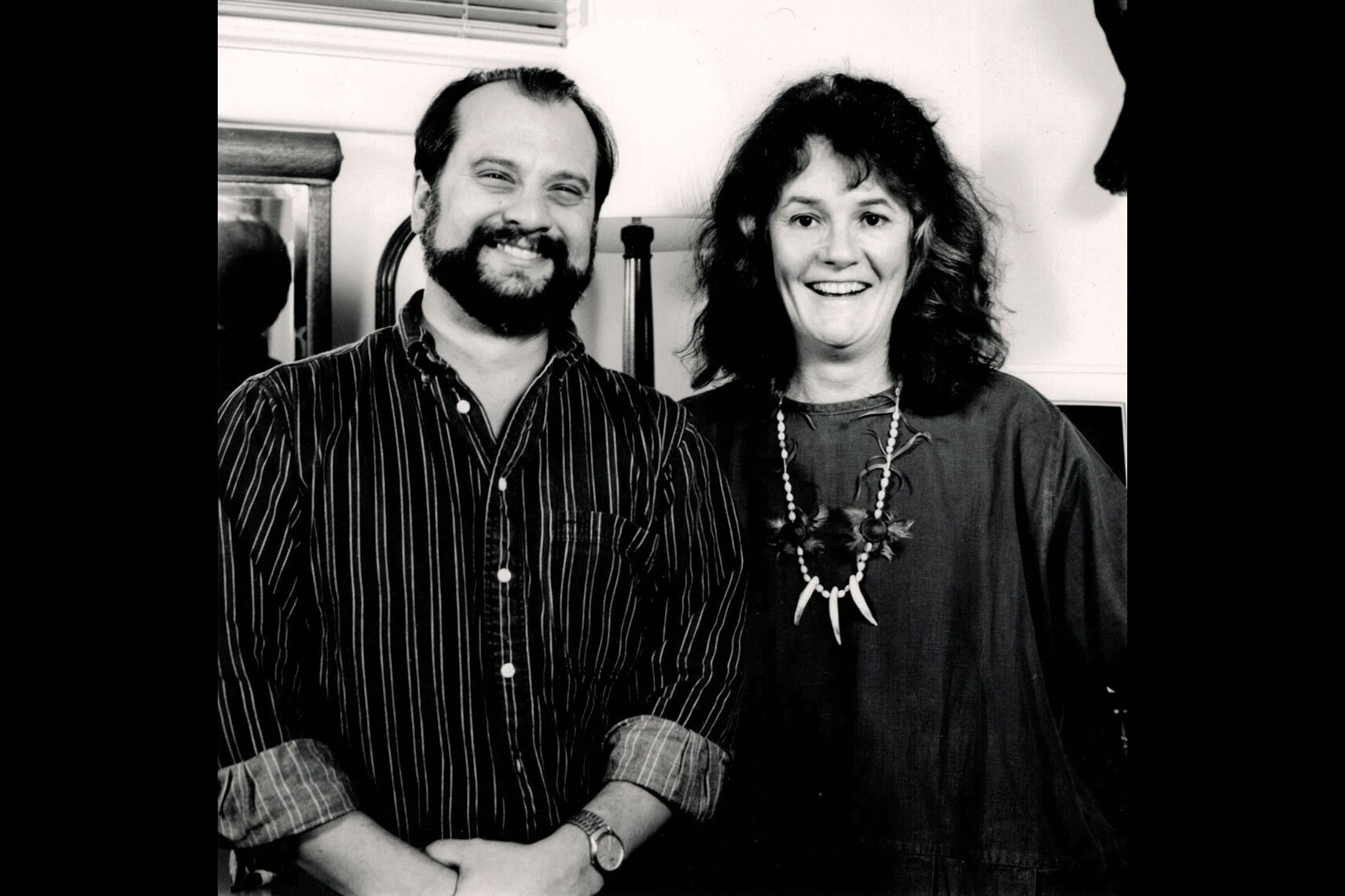
 BONOTOM STUDIO has been the designer of Contingencies for almost 30 years, but 30 years ago, there was no BonoTom Studio. There was, however, Bono Mitchell Graphics, a one-woman design studio at 15th & K Streets, in northwest Washington, D.C. It was there that the original look and feel of Contingencies was conceived. I joined Bono in the fall of 1989 and have worked on every issue of Contingencies but the first two. We incorporated and worked together until Bono retired in 2016. I sat down with Bono (sans tequila shots as in the old days) to share her remembrance about the startup.
Tom: Good morning, are you ready to talk Contingencies stories?
Bono: Oh sure. I have a lot of them.
You, as Bono Mitchell Graphics, were the original designer of Contingencies in 1989.
Yeah. I had an office on K Street, and actually Ken* used to freelance for me from time to time, so he was there at the beginning as well. I don’t remember exactly how it came about, but I met with the original publisher, Erich Parker, and the original editor, Dana Murphy, and from the get-go there was a trust and understanding that we wanted to make this a lasting project.
You were on K Street then, but you must have been building the studio in your house, because I joined forces with you in August of 1989 and worked with you on the September/October 1989 issue. And we worked out of your house.
That’s right, and remember, until you got there with your little Mac, all the work was done the traditional way, with typeset galleys, wax, X-Acto knives, burnishers, and pasteup.
And your room-sized stat camera.
Right, and I always made you change the chemicals.
Oh, I haven’t forgotten. We were still transitioning because, at the time, I had the computer, but I also had a typesetting machine in your basement. We sort of did it both ways, until we eventually produced everything only on the Mac.
I remember. I didn’t know a thing about computers at the time and would sit behind you and say “Move this higher.” “Make that text bigger.” “Change that rule to red.”
You were bossy.
Ha! You’ve mentioned that over the years. We didn’t have a scanner; we were still sending photos to China to get color separations, so even when we used the computer, it wasn’t yet anything like it is today. You couldn’t place ads. You didn’t see photos on the screen, just a black box placeholder, and the printer would physically strip in the photographs on the four negatives it took to produce a 4-color page.
The coolest thing—and the thing people don’t even think about today—was being able to wrap type around photos or other objects. That was a major feat with traditional methods.
Yeah, the good old days in graphics weren’t really all that good. Everything is much easier now, but what never changed was the thought process. Good design is good design. The only difference is how you get to the finished product.
Erich Parker was the founder of the magazine, and he really gave me free rein with the design and allowed me to do pretty much whatever I wanted to do. Plus, he frequently had really good ideas of his own.
In fact, all of the people we’ve worked with at the Academy over the years have been quite similar—they’ve allowed us to create, and they frequently have really good ideas, so it’s been a pretty exciting collaboration.
And with the exception of a few issues here and there over the years when there was a temporary fill-in editor, we’ve only really dealt with four “regimes,” if you will.
Right, who were they? (laughs). After Erich, there was Steve Sullivan, then Linda Mallon, and the current Eric [Harding]. All really smart, creative people. The Academy hires well.
The main thing that I think about Contingencies is the fact that the subject matter is all over the place. It was my favorite magazine because you never knew what the subject was going to be. Unlike other professions, like bankers, contractors, or whatever, actuaries really deal with all aspects of life.
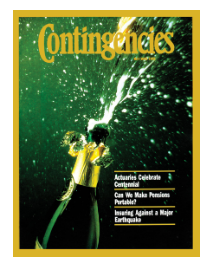
We’ve had stories about football, hurricanes, gambling, one about an actuarial poet, an issue about Charles Dickens, and one about Charles Ives. They’ve covered political issues, health care, redlining, and I can’t even remember what all else.
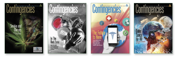
They had a story on holocaust survivors, one with a custom photoshoot including three infants, a story about a Buffalo soldier, not to mention the normal things you would think actuaries would cover like health insurance, Social Security, property loss, etc.
Yeah, the stories are much less about a particular industry and more about, well, just people and all aspects of peoples’ lives. Usually it was interesting to read the damn articles.
But there were some wonky ones we never understood.
True—stories that had so many charts and graphs and equations, that we had no idea what they were about. Heck, you’d have to be an actuary to understand it, but somehow we illustrated it!
That’s another great part of having worked on Contingencies was that there was a budget to hire some really good, internationally recognized illustrators like Richard Thompson, Guy Billout, Michael Glenwood, John Cuneo, John Pack, and so many others that I can’t name them all.
I’d look through the illustrator Workbook until I found the illustrator I thought as the one for that particular story.
Because it was a bimonthly, there was always time to consider design options. Should we use photos for this story, or does it need an illustrator, or can we illustrate it ourselves? I mean, it was just always fun.
It still is.